Full disclosure: I’m way in to typography and typeface design. If you’d like to catch up ahead of time on some of the terms you may come across, scroll to the bottom and flip through my “dig deeper” links in the sidebar.
Choosing a typeface for a project is a big responsibility. Your chosen type will go more places, be seen more often and have a greater long-term influence on your brand than you may think. If you don’t get it right, all those grand ideas about brand personality can be ruined in an instant by one bad face.
The typographic choices we made when creating the other half of Hightail’s visual identity were based on equal parts critical thinking and design aesthetic. It’s easy to just hit up a few links and find a typeface that you think looks cool, but that isn’t really a course that allows you to present your concepts in a way that doesn’t just sound like “my taste is better than yours.” You need some science, some art, some subjectivity and some taste-making.
The typeface that we selected to provide the foundation for our brand’s look, feel and personality is Verb, created by Yellow Design Studio. It had come to my attention in a Risings Stars email around the same time that we started our typographic search, so I placed it on our shortlist of faces to try out. What pushed Verb to the top of that list was three compelling elements that it shared with the nascent Hightail brand.

Character
Verb is a big family. A family with every kind of relative you need to have a good party. The fat, boisterous uncle, your wallflower cousin and your grandpa who wears long-sleeve shirts every day to cover up his Marine tattoos and tells it like it is.
The letters in the whole Verb family have a lot of character that gives the face a distinct look. But not so much that readers are distracted by a weird uppercase R, instead of focusing on headlines and button copy.
Balance
Verb also has a natural italic that fits really well with its regular uprights and since it’s a sans serif typeface, you don’t have the awkwardness that you sometimes see in serif italics: the italic just feels like an emphasized item; it doesn’t have a different look and feel.
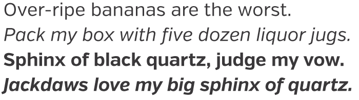
There is also a rhythm here that I always find enjoyable in neo-grotesque faces. The vertical axis makes Verb slightly geometric, but it doesn’t go completely square-and-circle (as seen in the collapse of the arms of the C’s, the descender on the lowercase g and the lowercase s). Thankfully, unlike a typical grotesque typeface, we have a single-story lowercase g and not one of those horrid double-bowl monstrosities. There is a bit of humanist flare here as well, but not enough to overwhelm you with contrast. We also found a bit of a eurostyle vibe in Verb that gives it a slight working-man quality.
Open & friendly
Verb has a somewhat hefty x-height (the size of a lowercase x) and I was a bit concerned at first. But the more I began to employ it across a variety of use cases, the more comfortable I got. The generous x-height made smaller sizes much more readable and at large sizes it made the letters a bit more playful. Having those large lowercase letters gives Verb a really open and welcoming feel. There isn’t anything closed off or restrained. It feels like a conversation among friends about something you both really care about. It’s friendly but not saccharine sweet.
How type can fit a brand
While it’s easy to just look at a whole typeface family and find things about the letters you like, choosing Verb was about more than just its nice letterforms. The right face has to work in the real world and help you build connections. There are several things to look at when choosing a corporate face (mostly built by people much smarter than I in the world of typography design and branding) and from that list I built up a set of loose leaf parameters that helped me to subjectively and impartially (with an acknowledgment of the art) choose a face that fits:
Audience
We knew that the audience we were targeting was web-savvy enough to give cloud storage and collaboration a try, so we wanted something that felt modern and clean, had an air of originality to it, but also something familiar.
Timeframe & mood
Mood helps you establish a stronger connection to where you want to mentally take your audience. We had nailed down our core user as a creator, so we wanted to make them feel energized and confident, while also making them feel like they’re using a modern tool. Verb did all that through its various widths. We could tailor messages in a better way with the different voices allowed by the face’s various weights and widths.
Canvas
It’s always important to choose a face that works where you’re going to be working, whether that’s print, mobile or web, in large or small print. We spent a lot of time looking at various typefaces in different scenarios and Verb holds its own. We’ve used it on mobile screens, dynamically on the web, in print and at a multitude of sizes. They all worked really well.
It’s unreasonable to think you’re ever going to find a typeface that is perfect in every situation, but we feel like Verb fits us well enough that we can either push through the times it doesn’t work or we can customize the messaging and situation to fit Verb a bit more closely. Either way, having the constraints and knowing them is a tool we can use to our benefit.
Typeface classifications
I love typography
Typographica
Type anatomy
Design is History
Typography Deconstructed
Typeworkshop
Does it feel right?
Ultimately, this is the most important question to ask when deciding on the right typeface for your brand. Verb definitely feels right for Hightail. It’s been a fun face to play with and the whole team is getting more and more comfortable with it every day. Verb is unique enough for us — as a company — to get behind and embrace. Even those outside of the design team are referring to it by name.
The buy-in from other Hightailers was a good sign that we’d landed in a sweet spot. A combination of the team accepting the face and it fitting into the groove we were aiming for provided the assurance that Verb was the right face for Hightail.
Overall, we’re really happy with Verb and, though there may be other typefaces we should have or could have considered, I think we made a great choice. Verb has turned in to a real work-horse and it will be with us for years to come.
Follow Aaron on Twitter.


Excellent choice! I’ve been using Verb for my branding too!