Christian Crumlish is the Director of Product at CloudOn. CloudOn makes Microsoft Office® (Word, Excel and PowerPoint) files more accessible and useful on your iPad, iPhone and iPod Touch letting you edit documents, spreadsheets and presentations from anywhere with all the functionality you need.
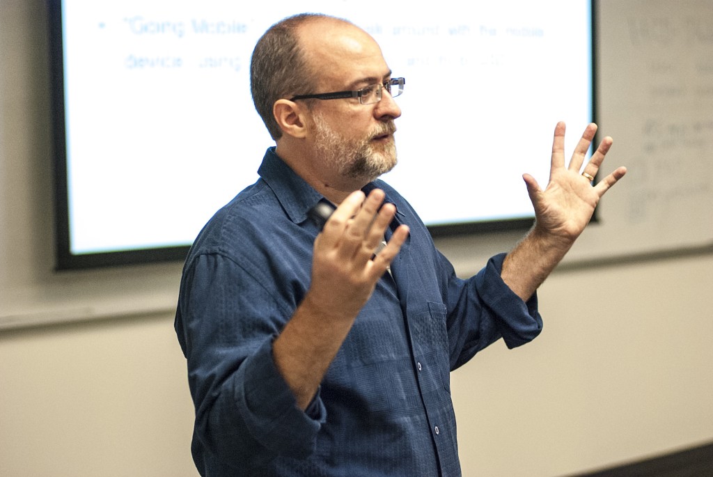
photo credit: Josh Luna / WebVisions
As smartphones have taken over the world, many product designers have embraced or experimented with a philosophy called “mobile first”. This approach involves embracing the constraints of small handheld devices to design a core, minimally valuable product that enables the user to accomplish the most important tasks. This mobile interface can then be selectively extended or scaled for traditional desk and laptop (or “desklap” as I like to call them) devices.
At CloudOn, where I’m Director of Product, we make an app that connects to cloud storage providers and enables users to access and edit Microsoft Office files on mobile devices and in web browsers. Our philosophy is a variation of the mobile-first concept that we call “tablet first”. Unlike the vast majority of digital products that started life in a web browser before taking tentative steps into the domain of mobile apps, CloudOn was born on a tablet. We saw an opportunity to take these newfangled tablet devices into the realm of productivity and ran with it.
In truth, our philosophy is more holistic than simply about starting with the tablet first. We approach user experience from a device-agnostic perspective, preferring to think conceptually about the user’s needs and the journey they take to get something done. We aim to understand people’s workflows, to see how and when they communicate with other people, before figuring out where and how we fit in. Only then do we apply our conceptual thinking to real-life devices.
The tablet-first approach fits with our holistic philosophy because tablets are blended devices. They are mobile but they have (relatively) big screens. They have the consumable qualities of a smartphone, but with the productivity potential of a desklap.
We have found that it can be a good idea to do your first device-specific design for the tablet, because solving the user’s problems on an iPad or a Nexus 7 lays a good foundation for extending the experience out across the full spectrum. As Google’s SVP of Ads and Commerce, Sridhar Ramaswamy says about tablet-first design:
“ brings into account things like swipe that are quite unique about how you think about an experience. Then if you start from there, then the mobile experience becomes a relatively simple space-constrained version of the design, while the desktop experience nicely generalizes this is what you do with the mouse. But the devil’s in the details.”
Indeed it is. When we first created the smartphone version of CloudOn (our second form factor), some aspects of the translation were easy(ish). Because of our initial attention to the overall concept design, most of our product flows crossed over well. But interpreting a holistic experience across multiple devices forced us to think more carefully about which aspects needed to be common to all devices and which were more tuned to a specific form factor.
For example, we decided to optimize the phone app for reading or consuming content, rather than working on it. After all, who wants to fiddle around with an Excel spreadsheet on their phone’s 3.3-inch display? Well, it turns out quite a lot of people do.
Once we launched the phone version of the CloudOn app, we were surprised to find many users were editing spreadsheets, slideshows and documents on those tiny screens. Sure, it’s nobody’s idea of the perfect experience, but sometimes it’s the only tool available and as photographers like to say: the best camera is the one you have on you. This century’s major shift in how we work means we’re all more willing to engage in tasks when we’re in a café, at the airport, watching TV or in a meeting.
The tablet will have an increasingly big part to play in this. When the iPad was released it was initially regarded as a consumer device, best suited for browsing content and not particularly useful for creative or generative work. Indeed most reports show peak tablet use in evenings and on weekends. At CloudOn, however, our analytics show usage peaks that follow the contours of the workday and the workweek. Clearly people are using our app on their tablets as one of their main work devices and not just as a convenient option for the train or sofa.
Right now, tablet productivity is different to sitting in front of your desklap. For me, it’s when I’m in a meeting room or sitting on a couch. I’m working but often not as intently: maybe reviewing or making small edits to an existing doc. But, my tablet is definitely not just for consuming and with tools like CloudOn and Hightail I have the means to do a lot of the same type of work that I would do on my laptop.
Even these usage patterns may be changing. On average, 55% of CloudOn users just read files without changing them, 35% edit files and 10% create new files. These figures hold for both tablet and smartphone users, even though we expected a smaller percentage of users to edit on the latter devices. While the vast majority of our users are working in a business context, one exception to this pattern is our student users, who often use tablets to create and work on longer projects.
It’s unclear yet if this is because students are true digital natives – a new generation with new work habits who are comfortable creating on touchscreen devices. Or perhaps their usage is more circumstantial: students are naturally more mobile, as they don’t have a set desk but move from class to class. Either way, this is a sign that the next cohort to hit the workforce might view tablets as one of their primary productivity devices.
Designing for tablet-first is therefore not just a good way to create a product for a medium-scale device before extending to other platforms. It also means you’re designing with the future in mind and creating a user experience with a longer lifespan.
Of course, technology changes so fast that it’s often hard to predict what the next groundbreaking new device will be or even how people will change how they use existing tools. By starting with a holistic approach to creating elegant solutions to real user problems, regardless of device, you’re prepared for whatever digital revolution lies ahead.

