Desktop. Trash can. Folder. Document. For more than 40 years, office-related metaphors have been central to our digital experience. But when you think about the fact that the designs, illustrations and videos you create on your computer are treated as “files”, the system begins to feel very outdated. It’s optimized for storage — you put your files in folders — and doesn’t encourage doing things or working with others. It’s time to shift our mental model.
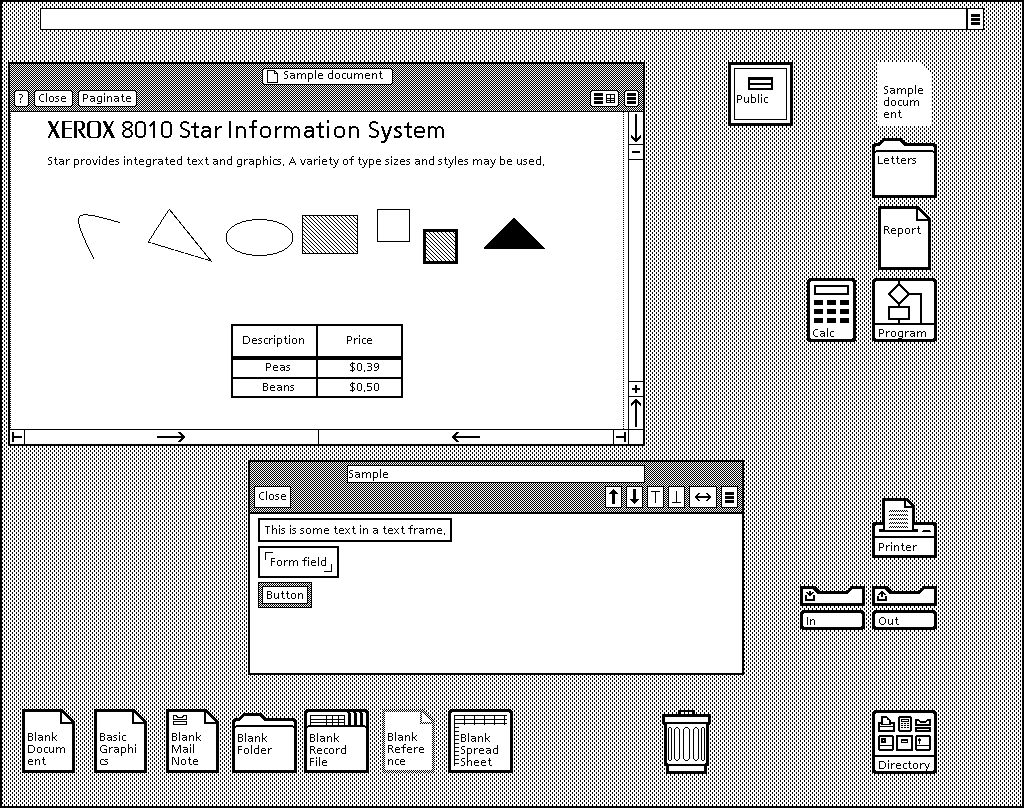
The desktop metaphor once served a noble purpose. The Xerox Star was the first computer to popularize the concept in 1981. Tasked with designing the “Office of the Future”, the Star’s development team decided to make the user experience more intuitive for the new home computing market by referencing the offices that people worked in.
Designer Dr. David Smith was influenced by art historian Ernst Gombrich’s theory that artists who successfully introduce new ideas always incorporate or play with existing conventions. He invented the concept of using icons to represent different pieces of digital information and referenced familiar office objects like folders, filing cabinets and trashcans in his designs for the Star.
Smith’s desktop metaphor is so powerful that it’s often hard to remember that these files and folders are not real, but a mere representation of how machines organize information. The file-less internet with just content to be acted on and unique features like hyperlinks should have heralded a move away from this paper paradigm but instead we just use it to store our files online.
Apple — which back in 1982 turned its Lisa machine into an icon-based model after seeing the Xerox Star — is now interested in moving away from this system. In 2005, Steve Jobs said that, “eventually, the file system management is just going to be an app for Pros, and consumers aren’t going to need to use it.”
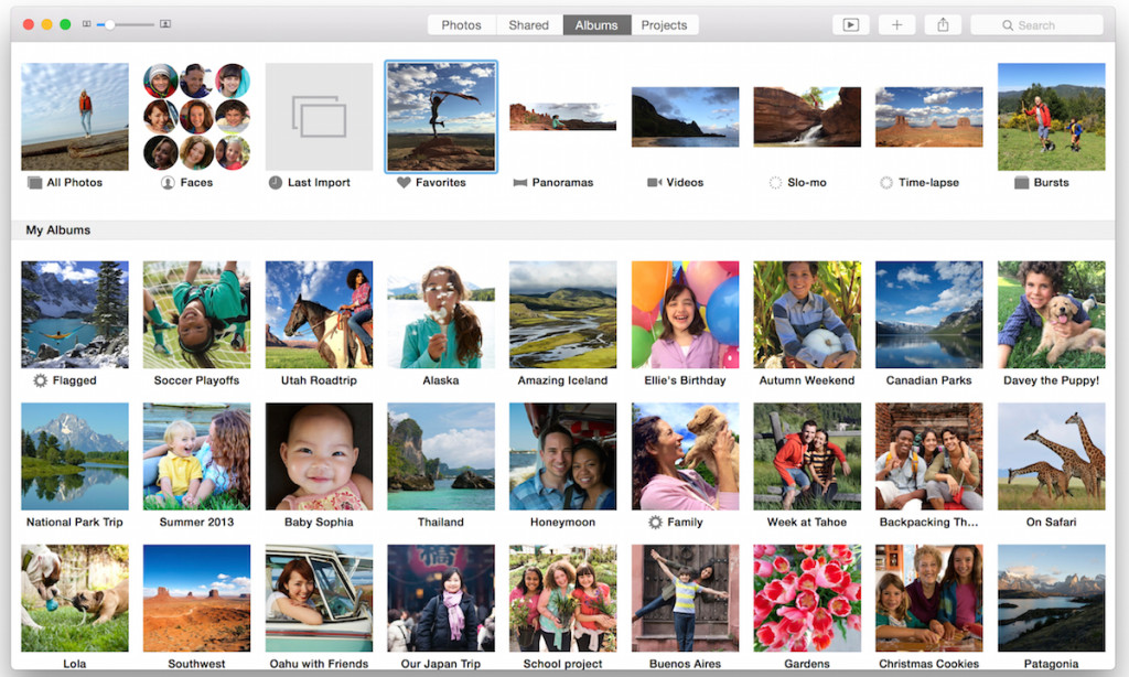
The company made its first significant attempts to do this with OS X by hiding files within applications, like importing your photographs directly to iPhoto, has so far proved frustrating for users. Most of us are too used to finding files in folders, copying them, moving them and sharing them.
At my company Hightail, sharing, storing and organizing files is our bread and butter. So what is wrong with this system? Why do we want to change it? And what does the alternative look like?
The problem with the desktop metaphor is that we simply don’t need it anymore. Most of us are fluent in digital and no longer need a translator. Millennials are digital natives and many of the metaphors make no sense to them, like the floppy disk that is still a widely used save icon.
More importantly, the file system distracts us from our real work. We spend a lot of time organizing folders, sharing work as abstract dot filetypes and saving received files to yet more folders. In the pre-digital age, administration was a necessary burden. You had to index, file and store documents, artwork and film otherwise you’d never find them again. The digital age was supposed to free us from such drudgery. Instead of wasting time on admin, we should be focusing on creating — whether that’s illustrations, spreadsheets or architectural drawings.
Maybe we are more ready than we think. Steve Jobs’ vision of a world without file management systems is a reality on iPhones and iPads, where apps and their content is all a user sees. This is what the broader digital future looks like and — recalling Gombrich’s theory of working with convention — the more content-centric experiences of mobile devices make the shift to larger, more work-oriented devices easier.
As for why Hightail wants to help bring about this change? We simply think that there is a better way to do things. When we started providing our service (known as YouSendIt), we wanted it to be for living documents — files that were constantly revised or accessed regularly — not a dumpster for things no longer required.
Files, though useful, are just metaphorical containers for content. What we love at Hightail is the ideas that are exchanged when files are shared. The photograph, not the jpg. The home page design, not the .ai file. The quarterly financial report, not the xls.
That’s why our new service, Hightail Spaces leads with your content and the actions that help you do things with your work — from sharing and collecting feedback, to adding new versions and getting final approval. We’re especially interested in creative collaboration, which is what happens when creative professionals and stakeholders take a project from concept to completion, via multiple rounds of iteration and feedback.
The artists, architects, ad execs, photographers, filmmakers and marketing managers involved in this creative process should be able to focus on the work itself, not the minutiae around it. More creative, less process. By dragging the desktop metaphor to the trashcan, we want to help update people’s mental model, eliminate dreary admin and get everyone working more effectively than ever.


I don’t understand. Though I love the idea of changing paradigms and ridding one of older models for organization, I don’t understand the new model.
I think the new model is that if you want a file, you will open the Ap to get at it. From there you can send/share/modify. Like the iPhone & iPad, however, we all still need a home base to start from and it looks like a desktop…. There are no file folders or trash can on them though. The icons are also Ap-specific. No more images of the work force to make our brains understand what’s going on.
The Millennial’s brains don’t even function the same way ours do so the real future model will probably be designed by one of them…
Guess I must be old. I am totally lost here.
Why should we be asked to disassociate a model that we understand in exchange for a giant cell phone? All my photos and videos are totally unmanageable when automatically sent to “photos”. Are you kidding? You may love digital “ai”, but handing over the organization and ability to locate a specific file to a computer’s discretion is a very bad decision (can you say “Windows 8”?) I have seen the “Millennials” at work and play. I have seen their digital knowledge (and in many, their lack of social skills). They are not a group to be envied. From a company’s perspective, perhaps it is easier for a company to just shuttle info to a set place. For a user to find it (after a mechanical entity has placed it) is not always that easy. I truly do NOT want a computer to make more decisions about my content than it already does, thanks!
Why change the paradigm? What does it get us? The article advocates for change, seemingly for the sake of getting rid of the old, but it doesn’t make a convincing argument for what is gained.
I agree that skeuomorphisms can be limiting. There’s no reason for my digital calendar to have a faux leather look, and that desire to imitate something in the real world may prevent creating a calendar with increased functionality.
I also agree that Steve Jobs was right. Applications are moving in the direction of hiding the file structure. They are doing that to help non-professionals, probably better described as “non-techies.” Steve was advocating hiding the file structure because it’s confusing to many people, and Apple must appeal to the masses. That doesn’t change the fact that behind every non-techie is a techie supporting them. Those non-techies come to us techies and ask us to find and post those files. They depend on us to keep things organized, even if they don’t see that system. Any system you design should keep in mind that not everyone uses the system in the same way. If I go to a library, I may ask for help finding a book because I don’t want to learn the decimal system, but the librarian still needs to understand that underlying system.
The problem I have with the desire to simplify for everyone, and why I’m frustrated with my iPhone, iPhoto, and some websites aimed at collaboration, is that the underlying system is not transparent, and therefore limits my capabilities. By restricting me, a techie who needs to understand the underlying system, to a simplistic paradigm aimed at casual users and non-techies, you make the system less flexible and less capable. For example, my iPhone doesn’t make it easy for me to access the same document in multiple apps. iPhoto doesn’t make it easy for me to edit a file in Photoshop. And now you’ve got me jumping through hoops, wasting my time figuring out a more complicated system than the file structure you were trying to replace.
A better strategy is to realize that there is usually a librarian. Give them the power to organize things for their patrons. It’s fine to have two layers, one for the techie, and one for the casual or occasional user. And don’t innovate because you’re tired of the old system, innovate because it works better. Some systems stick around for centuries because they just work better. Your article fails to explain why hiding the file structure makes collaboration easier.
One last note. Whenever someone asks me which file sharing service to use, I recommend Hightail over Dropbox. (I share mostly videos, BTW.) Why? Because I feel like Hightail I can understand and predict what it’s going to do with my files. That’s because it uses a paradigm I can understand. Dropbox does what iPhoto does. It says, “don’t worry yourself about how it works, we’ll handle that for you,” and then I have files disappearing and wasting my bandwidth syncing things I don’t want synced. I don’t like programs that take away control for the sake of simplicity. I like programs that use elegant design to leverage tremendous power. That’s what the desktop metaphor did for the command line interface. I’m open to the next step, let’s just make sure it is enhancing capability, not removing it.
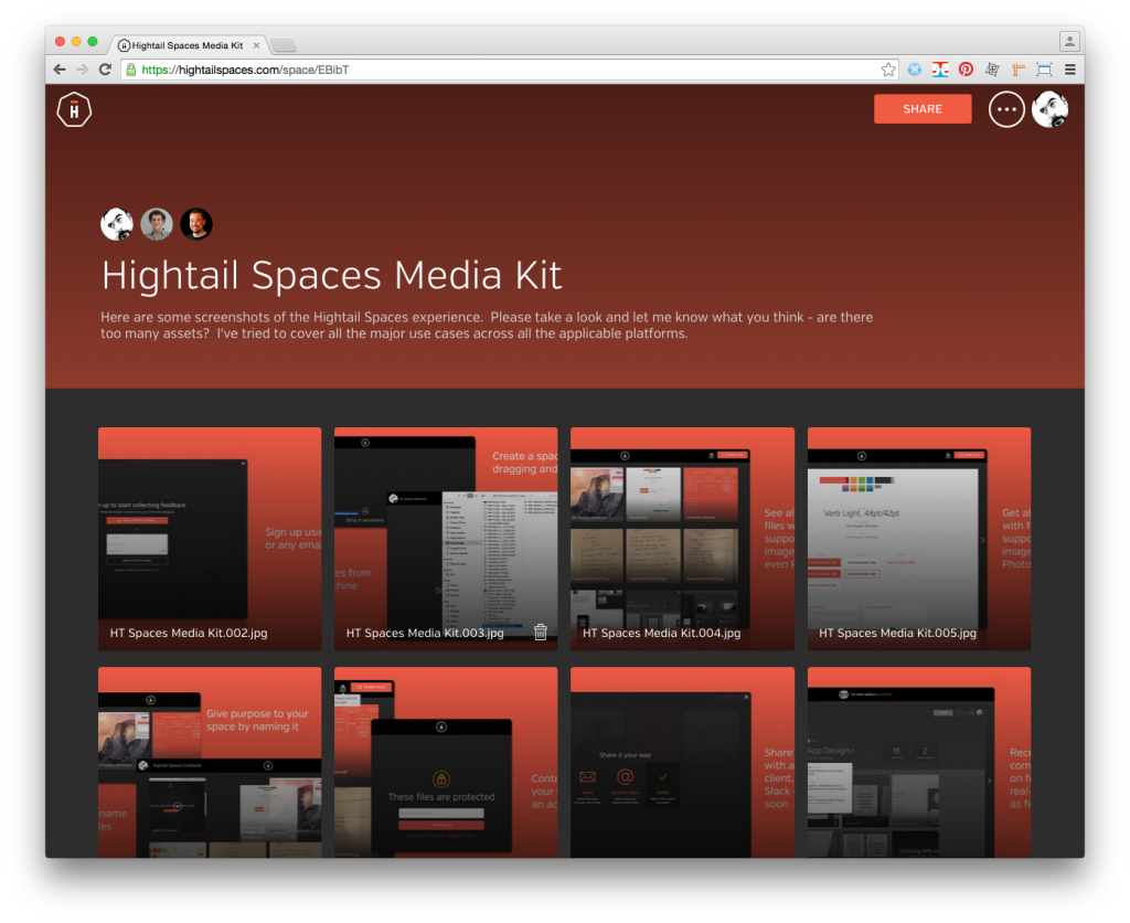
Enough of the abstract philosophy. I’ve just looked at your Spaces Media Kit. I have not tried it yet. But based on your media kit, here are some specific thoughts.
1. Under “Seemless File Sharing” you have a screen shot that looks for simple and straight forward. I get that this is hassle-free. But if I have thirty different files, how do I point my executive to the right one? How do I know what version he’s seeing? How do I hide what I don’t want him to see? If I sent my exec to this screen, the response I’d expect would be “there were thirty videos and I couldn’t find the one I needed. Just give me the one you want me to see.”
2. “Contextual Feedback.” This is a brilliant idea, except for one problem. It won’t stop my execs from sending me feedback in email. Now I have to check two places, raising the probability that I’m going to miss an important comment and wasting my time. This is the big problem I’ve seen with other collaboration websites: They add confusion, not clarity. If you want to change feedback, you have to REPLACE and UNIFY email and text messages, not give another alternative. Obviously, this is hard. That’s why it hasn’t been done.
3. “Visual Versioning.” I’d have to see how this works to give meaningful feedback. I like the idea. I wonder how it works with videos where the difference is not immediately apparent. Again, usually my execs want me to hide all previous versions because they add confusion. But not having to rely on elaborate naming systems to tell one version from another, which is what I do now, would be helpful. Ideally, my exec would see one version: The most recent. But there would be the capability to step in and see a timeline of past versions. I have yet to see this done well. This would be a great innovation to the old desktop file structure.
4. “Designed for Mobile.” Great, another app. If it works really well, and the video doesn’t skip, it may actually get adopted in my workplace. If not, people will hate using it the way they hate most streaming video apps. I still have a problem with the feedback system mentioned in item #2. Again, this all depends on getting everyone to use the app, which takes some doing, but might happen if the app is amazing and bug free.
5. “Unite Your Team.” No idea. I’d have to see it work.
Do you know what my execs have been asking for for years? “Can’t you send me the video in my email?” They want to open their email, see the video, hit play, and watch it right away, in the email. They don’t want to download it or go to another app. They want to be able to reply with quick comments via email. It sounds terribly old-school, right? But on some level, they are right. That would be really simple and easy. I guess they’re asking for their email and collaboration apps to be unified. On some level, that’s what your mobile app is trying do, but it’s still another app.
Sorry for writing the longest comment ever. I wish you luck. I will try your new innovations. But please don’t ever get rid of the fast, straight-forward, bullet-proof Hightail that I love.